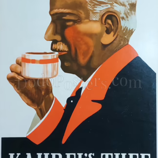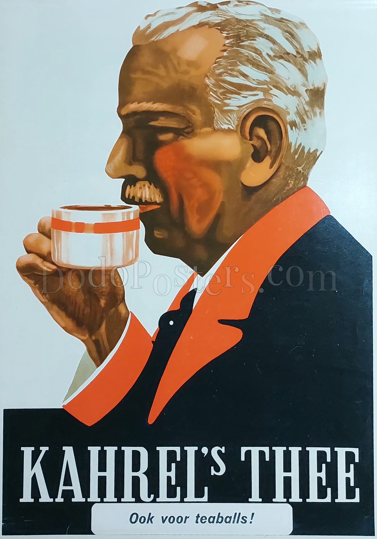
Description
A close-cropped profile of a silver-haired gentleman raises a teacup, rendered with bold shadows and warm cheek tones against a pale ground. The brand name “KAHREL’S THEE” sits in large white capitals on a black base panel, with the Dutch line “Ook voor teaballs!” meaning “Also for tea-balls!” (tea infusers).
Kahrel’s was a long-established Dutch tea concern associated with Groningen, and this design reflects the interwar shift toward simplified, instantly legible product advertising.
Lithographic printing on glossy heavy stock, using flat colour fields and airbrushed modelling characteristic of 1920s–30s Continental poster design.